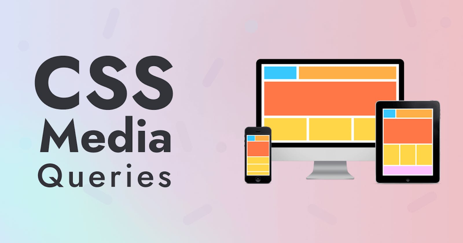
What is Media Query?
Day 15 : 60 Days Of Full Stack Web Development Challenge
CSS Media query is a W3C recommendation and a CSS3 module which is used to adapt to conditions such as screen resolution (e.g. Smartphone screen vs. computer screen).
The media query technique first used in CSS3.
It became a W3C recommendation in June 2012.
It is an extension of media dependent stylesheets used in different media types (i.e. screen and print) found in CSS2.
The most commonly used media feature is "width".
It uses the @ media rule to include a block of CSS properties only if a certain condition is true.
Recommended Media features for Media queries :
Following is a list of media features recommended for media queries by W3C.
| Feature | Value | Min/Max | Description |
| color | integer | yes | It specifies the number of bits per color component. |
| color-index | integer | yes | It specifies the number of entries in the color lookup table. |
| device-aspect-ratio | integer/integer | yes | It specifies the aspect ratio of the device. |
| device-height | length | yes | It specifies the height of the output device. |
| device-width | length | yes | It specifies the width of the output device. |
| grid | integer | no | It is true for a grid-based device. |
| height | length | yes | It specifies the height of the rendering surface. |
| monochrome | integer | yes | It specifies the number of bits per pixel in a monochrome frame buffer. |
| resolution | resolution ("dpi" or "dpcm") | yes | It specifies the resolution of the display screen. |
| scan | "progressive" or "interlaced" | no | It specifies scanning process of "tv" media types. |
| width | length | yes | It specifies the width of the rendering surface. |
What is Responsive Web Design?
The term Responsive Web Design was given by Ethan Marcotte. It facilitates you to use fluid grids, flexible images, and media queries to progressively enhance a web page for different viewing contexts i.e. Desktop, Smartphone, Tablet etc.
What is Responsive Web Design?
Responsive web design makes your web page look good on all devices.
Responsive web design uses only HTML and CSS.
Responsive web design is not a program or a JavaScript.
Designing For The Best Experience For All Users :
Web pages can be viewed using many different devices: desktops, tablets, and phones. Your web page should look good, and be easy to use, regardless of the device.Web pages should not leave out information to fit smaller devices, but rather adapt its content to fit any device:
Desktop :

Tablet:

Mobile:

It is called responsive web design when you use CSS and HTML to resize, hide, shrink, enlarge, or move the content to make it look good on any screen.
What screen resolutions do you use while taking screenshots?
Smartphone: 320px
Tablet: 768px
Netbook: 1024px
Desktop: 1600px
Example:
<!DOCTYPE html>
<html>
<head>
<meta name="viewport" content="width=device-width, initial-scale=1.0"/>
<style>
body {
    background-color:yellow;
}

@media only screen and (max-width: 500px) {
    body {
        background-color:green;
    }
}
</style>
</head>
<body>
<p>If you resize the browser window and the width of this document is less than 500 pixels, the background-color is "green", otherwise it is "yellow"</p>
</body>
</html>
Break point :
We often hear the term Break point in CSS.
CSS breakpoints are points where the website content responds according to the device width, allowing you to show the best possible layout to the user.
CSS breakpoints are also called media query breakpoints, as they are used with media query.
From the above example we can say that, 768px and 769px are the break points.
Break points in CSS for different screen sizes :
320px — 480px: Mobile devices.
481px — 768px: iPads, Tablets.
769px — 1024px: Small screens, laptops.
1025px — 1200px: Desktops, large screens.
1201px and more — Extra large screens, TV.
Orientation
One well-supported media feature is orientation, which allows us to test for portrait or landscape mode. To change the body text color if the device is in landscape orientation, use the following media query.
@media (orientation: landscape) {
  body {
    color: blue;
  }
}
Advantages Of Media Query:
Responsive Design: Media queries enable responsive web design, allowing your website to adapt to different devices and screen sizes. This is crucial for providing a consistent and user-friendly experience across desktops, tablets, and smartphones.
Targeted Styling: With media queries, you can apply specific styles based on various criteria such as screen width, height, orientation, resolution, and even device type (e.g., print, screen, handheld). This level of targeting helps tailor the appearance of your website for different contexts.
Improved User Experience: By optimizing your website's layout and content presentation through media queries, you can enhance the overall user experience. For example, you might adjust font sizes, reposition elements, or change the navigation structure to better suit smaller screens.
Bandwidth Optimization: Media queries can also be used to load different image sizes or completely different content based on the device's capabilities. For instance, you might serve high-resolution images to desktop users while delivering compressed versions to mobile users, thus optimizing bandwidth usage.
Search Engine Optimization (SEO): Responsive design, facilitated by media queries, can positively impact SEO. Search engines like Google prioritize mobile-friendly websites in their rankings, so ensuring your site looks good and functions well on mobile devices can improve its visibility in search results.
Future-Proofing: As new devices with varying screen sizes and capabilities emerge, media queries provide a flexible and scalable approach to design. They allow your website to adapt and remain functional across a wide range of devices without requiring separate designs for each.
Conclusion:
Is article explores Advanced CSS Properties Such As Media Query and their representation, as well as the pros and cons of each. We delve into commonly used methods for defining Media Query in CSS.Feel free to leave any comments or questions below. If you found this article informative, please share it with your network. Thank you.
What Next ?
Advanced CSS Such As Transform 2D,3D....
