Introduction to CSS Flexbox
Day 13 : 60 Days Of Full Stack Web Development Challenge
Introduction to CSS Flexbox :
CSS3 Flexible boxes also known as CSS Flexbox.
IT is a new layout mode in CSS3.
The CSS3 flexbox is used to make the elements behave predictably when they are used with different screen sizes and different display devices.
It provides a more efficient way to layout, align and distribute space among items in the container.
It is mainly used to make CSS3 capable to change its item?s width and height to best fit for all available spaces.
It is preferred over block model.
What exactly is a flexbox?
Flexbox is a CSS display type design to help us craft CSS layouts quite easily.
Control the position, size and spacing of elements relative to their parents elements and each other.
They are great for responsive designing.
It has its own set of properties.
It defines formatting context, which controls layout.
It is a parent-child relationship.
Features of flexbox:
A lot of flexibility is given.
Arrangement & alignment of items.
Proper spacing
Order & Sequencing of items.
Bootstrap 4 is built on top of the flex layout.
Before the Flexbox Model:
Block: It is used to make sections in web pages.
Inline: It is used for text.
Table: It is used for two-dimensional table data.
Positioned: It is used for the explicit position of an element.
There are 2 main components of the Flexbox:
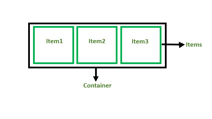
Flex Container: The parent “div” which contains various divisions is called a flex container.
Flex Items: The items inside the container “div” are flex items.

For creating the flexbox, we need to create a flex container along with setting the display property to flex.
Flexbox Axes:
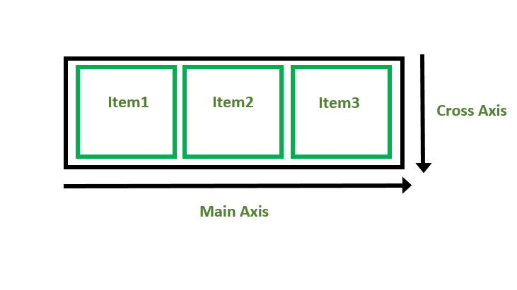
While working with Flexbox, we deal with 2 axes:
Main Axis
Cross Axis

Main Axis:
By default, the main axis runs from left to right.
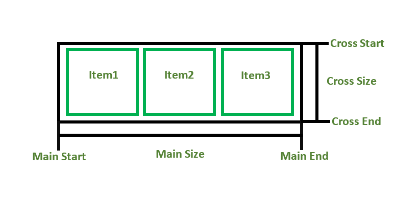
Main Start: The start of the main axis is called Main Start.
Main Size: The length between Main Start and Main End is called Main Size.
Main End: The endpoint is called Main End.
Main And Cross Axis

left to right:
flex-direction: row;
right to left:
flex-direction: row-reverse;
top to bottom:
flex-direction: column;
bottom to top:
flex-direction: column-reverse;
Cross Axis:
The cross axis will be perpendicular to the main axis.
By default, Cross Axis runs perpendicular to the Main Axis i.e. from top to bottom.
Cross Start: The start of the Cross axis is called Cross Start.
Cross Size: The length between Cross Start and Cross End is called Cross Size.
Cross End: The endpoint is called Cross End.
Example:
<!DOCTYPE html>
<html>

<head>
    <title>Flexbox Tutorial</title>
    <style>
    .flex-container {
        display: flex;
        background-color: #32a852;
    }

    .flex-container div {
        background-color: #c9d1cb;
        margin: 10px;
        padding: 10px;
    }
    </style>
</head>

<body>
    <h2>Aditya Gadhave</h2>
    <h4> Flexbox</h4>
    <div class="flex-container">
        <div>Item1</div>
        <div>Item2</div>
        <div>Item3</div>
    </div>
</body>

</html
Output:

Flexbox Justify-Content :
The CSS3 justify-content property is used to define the alignment along the main axis.
It is a sub-property of CSS3 Flexbox layout module.
It sets the Flexbox container's item horizontally when the items don?t use all the available space on the main axis.
Its possible values are:
**flex-start:**It is the default value. It sets the items at the beginning of the container
**flex-end:**It sets the items at the end of the container.
**Center:**It sets the items at the center of the container.
**space-between:**It sets the items with space between the lines.
**space-around:**It sets the items with space before, between, and after the lines.
Example:
<!DOCTYPE html>
<html>
<head>
<style>
.flex-container {
    display: -webkit-flex;
    display: flex;
    -webkit-justify-content: flex-end;
    justify-content: flex-end;
    width: 400px;
    height: 200px;
    background-color: lightpink;
}
.flex-item {
    background-color: brown;
    width: 100px;
    height: 100px;
    margin: 10px;
}
</style>
</head>
<body>
<div class="flex-container">
  <div class="flex-item">flex item 1</div>
  <div class="flex-item">flex item 2</div>
  <div class="flex-item">flex item 3</div>
</div>
</body>
</html>
Output:

justify-content: center;

justify-content: space-between;

flex-wrap property :
The CSS flex-wrap property is used to specify whether flex items are forced into a single line or wrapped onto multiple lines.
The flex-wrap property allows enabling the control direction in which lines are stacked.
It is used to designate a single line or multi-line format to flex items inside the flex container.
The CSS3 Flexbox flex-wrap property specifies if the flex-items should wrap or not, in the case of not enough space for them on one flex line
Its possible values are:
nowrap: It is the default value. The flexible items will not wrap.
wrap: It specifies that the flexible items will wrap if necessary.
wrap-reverse: It specifies that the flexible items will wrap, if necessary, in reverse order.
nowrap:
<!DOCTYPE html>
<html>
<head>
<style>
.flex-container {
    display: -webkit-flex;
    display: flex;
    -webkit-flex-wrap: nowrap;
    flex-wrap: nowrap;
    width: 300px;
    height: 200px;
    background-color: lightpink;
}
.flex-item {
    background-color: brown;
    width: 100px;
    height: 100px;
    margin: 10px;
}
</style>
</head>
<body>
<div class="flex-container">
  <div class="flex-item">flex item 1</div>
  <div class="flex-item">flex item 2</div>
  <div class="flex-item">flex item 3</div>
</div>
</body>
</html>
Output:

Using wrap value :
flex-wrap: wrap;

Using wrap-reverse value :
flex-wrap: wrap-reverse;

Flexbox align-items :
The CSS3 flexbox align-items property is used to set the flexible container's items vertically align when the items do not use all available space on the cross-axis.
Its possible values are:
stretch:It is the default value. It specifies that Items are stretched to fit the container.
flex-start:It sets the items at the top of the container.Backward Skip 10sPlay VideoForward Skip 10s
flex-end:It sets the items at the bottom of the container.
center:It sets the items at the center of the container (vertically).
baseline:It sets the items at the baseline of the container.
Example:
(Using stretch value)
<!DOCTYPE html>
<html>
<head>
<style>
.flex-container {
    display: -webkit-flex;
    display: flex;
    -webkit-align-items: stretch;
    align-items: stretch;
    width: 400px;
    height: 200px;
    background-color: lightpink;
}
.flex-item {
    background-color: brown;
    width: 100px;
    margin: 10px;
}
</style>
</head>
<body>
<div class="flex-container">
  <div class="flex-item">flex item 1</div>
  <div class="flex-item">flex item 2</div>
  <div class="flex-item">flex item 3</div>
</div>
</body>
</html>
Output:

Using flex-start value
align-items: flex-start;

Using flex-end value :
align-items: flex-end;

Using center value :
align-items: center;

Using baseline value :
align-items: baseline;

Flexbox align-content :
The CSS3 Flexbox align-content property is used to modify the behavior of the flex-wrap property.
It is just like align-items, but it aligns flex lines instead of flex items.
Its possible values are
stretch:It is the default value. It specifies lines stretch to take up the remaining space.
flex-start:It specifies that lines are packed toward the start of the flex container.
flex-end:It specifies that lines are packed toward the end of the flex container.
center:It specifies that lines are packed toward the center of the flex container.
space-between:It specifies that lines are evenly distributed in the flex container.
space-around:It specifies that lines are evenly distributed in the flex container, with half-size spaces on either end.
Example:
<!DOCTYPE html>
<html>
<head>
<style>
.flex-container {
    display: -webkit-flex;
    display: flex;
    -webkit-flex-wrap: wrap;
    flex-wrap: wrap;
    -webkit-align-content: center;
    align-content: center;
    width: 300px;
    height: 300px;
    background-color: lightpink;
}
.flex-item {
    background-color: brown;
    width: 100px;
    height: 100px;
    margin: 10px;
}
</style>
</head>
<body>
<div class="flex-container">
  <div class="flex-item">flex item 1</div>
  <div class="flex-item">flex item 2</div>
  <div class="flex-item">flex item 3</div>
</div>
</body>
</html>
Output:

Conclusion:
is article explores Flex Model and their representation, as well as the pros and cons of each. We delve into commonly used methods for defining Flex Item in CSS.Feel free to leave any comments or questions below. If you found this article informative, please share it with your network. Thank you.
What Next ?
Advanced CSS Such As Annimation ...
